Dashboard
-
Role
Product Designer & Software Engineer -
Company
Parasoft Corp. -
Date
2012 - Present -
Technologies
Angular.js, node.js, LESS, grunt, bower, Java, MySQL
My Role
New (UI/UX) Blood
Parasoft is a company known for its software testing tools: static analysis, unit testing, web functional testing, and service virtualization.
Never having had a developer that specialized in the front end, joining the company meant new opportunities for personal growth in bringing a legacy product out of maintenance. This meant being inquisitive when features were being discussed and framing requirements as user needs. I used tools like personas to flesh out user stories, user maps to explore workflows, and wrote functional specs before prototyping features.
The Goal
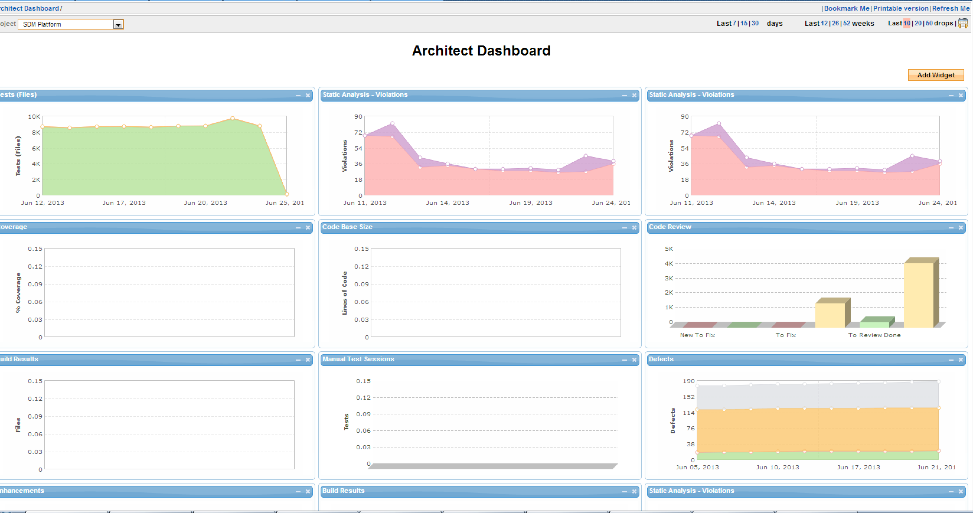
Create a dashboard. Easy.
Immediate Problems
- Users have expectations of what a dashboard should look like.
- Different kinds of users want specific data on their charts, leading to lots and lots of permutations of charts that differ only by their axis label.
- Adding a visualization quickly becomes looking through a long list of wordy descriptions to find the right chart.
Can you explain what these charts mean again?
Reduce Complexity
We should not presume to know what the users want as we are not the gatekeepers of their data. Instead, we need to think about our product as a tool that allows users to focus. We don’t dictate what they focus on, but we allow them to have the freedom to explore the data. Who knows what they will find.
When reports are specific, complicated, and hard to find, it requires our users to think the way we do. We needed a design that would require us, the developers to do the heavy lifting, and allow the users freedom to explore their data.
Knolling
- Put away the things that are not in use
- Group all ‘like’ objects
- Square the objects
Corollary
- Let users discover areas of concern.
- Let users keep track of these areas with widgets and reports.
- Push users towards taking action.
If language be not in accordance with the truth of things, affairs cannot be carried on to success. –Tsun Tzu
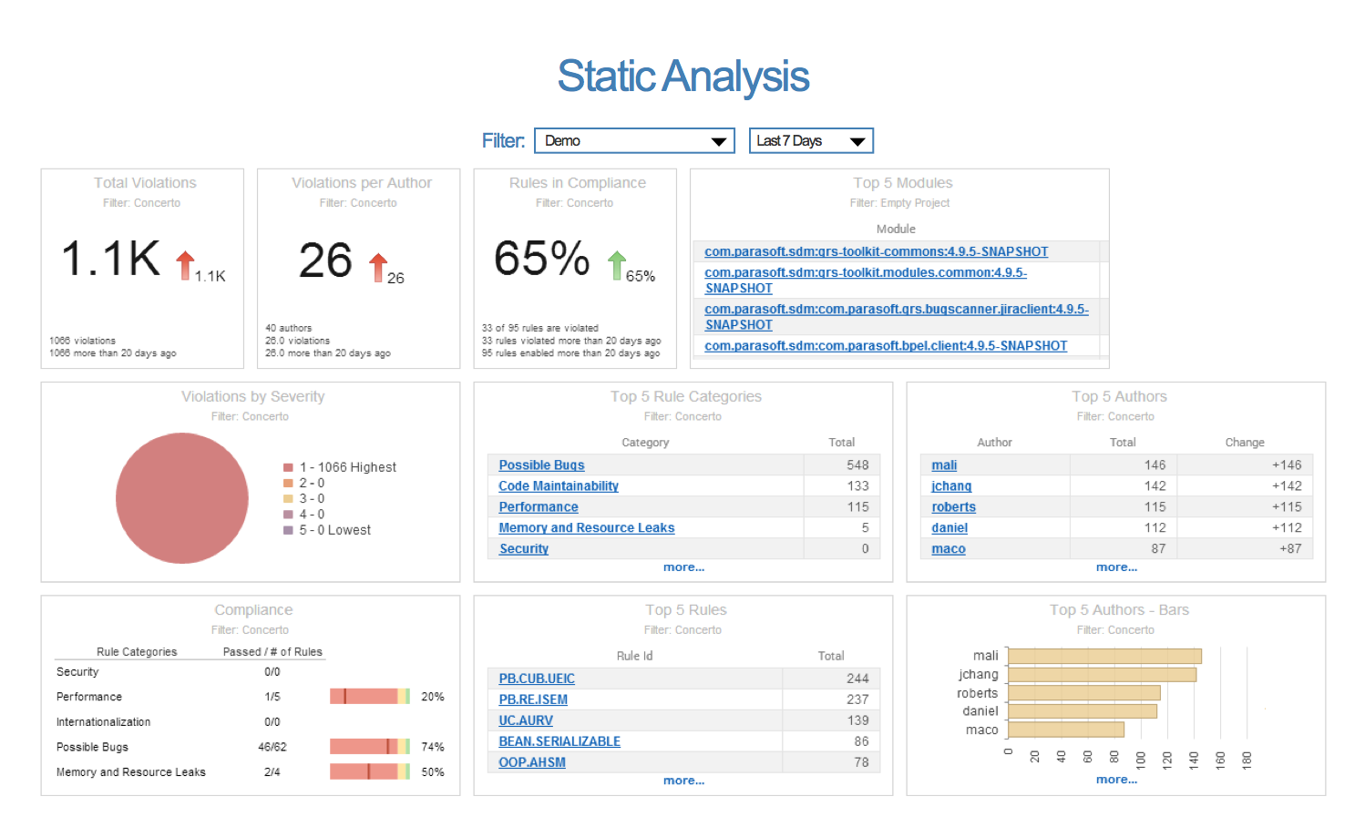
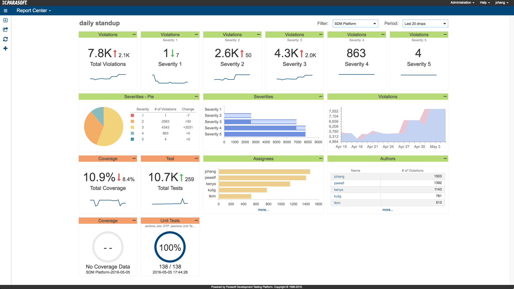
Standardized Visualizations
Based on the work of Stephen Few’s Information Dashboard Design, we created a set of basic visualizations that would be able to present data in a consistent, coherent, and unassuming manner.
In Retrospect
Rewrites are Hard
Inheriting a legacy product has its issues as further development either means keeping everything the same and making more of the same old thing, or tearing out certain parts in order to rethink certain paradigms. Code rewrites are already a tricky business, but when the entire architecture from a concepts perspective needs to be rethought, it requires a lot of work.
Reclaiming Zero
When we let users keep track of problem areas that they discover, we make zero worth something. It means that their work is done. It gives the users a sense of completion, a sense of satisfaction.